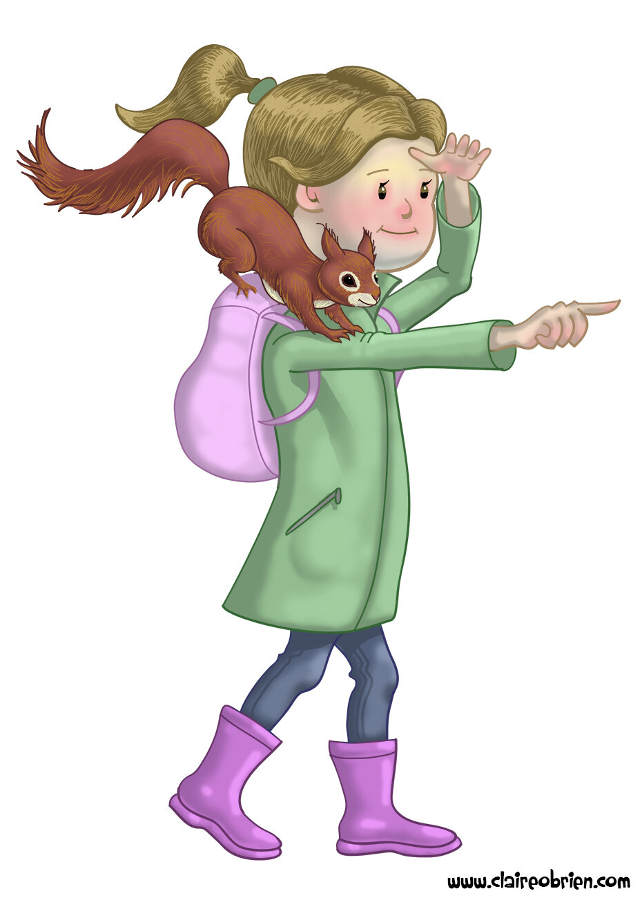
Well it has been three years since I actively started blogging and as it is January it is a time for reflection upon what I got up to in the last year. In general I have blogged less this year, probably due to returning to the world of work after an extended maternity leave, but I have still endeavoured to become a picture book Author and Illustrator, which is what my blogging aims to document.
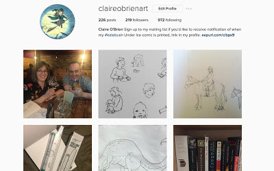
So this year I started my Instagram account after hearing that it is how a lot of illustrators get spotted by agents. I like it as a platform and it brings my work to a new audience judging from the likes and follows. I treat it as a sketchbook showcase and show different work from what I show on my Facebook page and Twitter. I’ve have not been approached by any agents yet though.
Speaking of agents, after going to the brilliant SCBWI Workshop; Getting Your Picture Book onto the Page with Elizabeth O Dulemba, I chatted with Sheila Averbuch about how she found Writer’s Digest Webinars (the live ones with access to editors and agents) very valuable in her path to publishing. So I decided to try one and bought How to Write a Picture Book That Sells complete with a critique from a US agent . While I found the webinar itself to be just okay (useful content but delivered by reading from slides) I was more interested in getting a professional critique on my current ‘best’ manuscript. For the money I paid, I was initially disappointed with the four lines of feedback that I received. The first two lines were positive and then I read these comments;
I couldn’t believe it, especially as I had just added more conflict to my latest draft, in truth I felt a bit despondent and stopped writing for a little while. A few months later there was an opportunity to have a 121 session with Skylark a UK literary agency, organised by SCBWI BI NE. So I got that manuscript out and read it again, I still thought it was good until I analysed it using Alayne Kay Christian’s Art of Arc self-study exercises . The agent was right there wasn’t actually any story there at all. It was a bittersweet moment of realisation that I need to revise that manuscript more before I can send it out for submission again.
So I didn’t submit this Picture Book manuscript to Skylark as it obviously wasn’t ready and because they are mainly Young Adult and Middle Grade agents. Instead I decided to submit an old comic script that I had recently re-drafted. And I was very surprised to get great feedback from Joanna Moult. Find out what she said here in Em Lynas’s write up of the event. So I now feel encouraged to continue working on the both the comic a bit more and the picture book.
This year I have increased my volunteering duties for SCBWI, not only did I hang the SCBWI Illustrator Showcase in Seven Stories again, I am also now co-Network Organiser for the North East alongside Marie-Claire Imam-Guitierrez. You can read an interview with me about the role in SCBWI's Words and Pictures, online magazine. So far I have learnt a lot from watching Marie-Claire organise the wonderful Creating Believable Characters Event and I will be organising an Illustration event in the next few months.
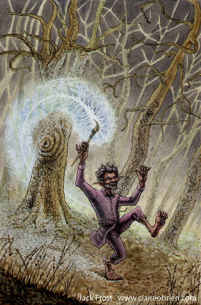
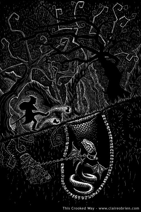
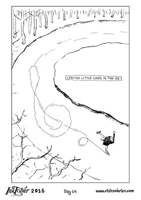
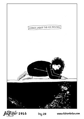
My artwork output has diversified this year and now includes Caricatures and Comics! Both as a result of doing Inkotber. I’ve done three Inktobers now and for Inktober2016 I wanted to do something a bit bigger to grow my audience. I thought I’d draw and ink a page of my comic manuscript everyday but realised how ambitious that would be in the timescale of a month. Instead I adapted Kate Bush’s song Under Ice into a 16 page, one panel per page, minicomic. I am a massive fan of Kate Bush and was lucky enough to go to a concert of hers during her 2014 residency at the Eventim Apollo. Under Ice is a song from a suite called the Ninth Wave on her 1985 album Hounds of Love. It is a very visual suite of songs that I interpret as being about a woman falling overboard a ship and slipping in and out of consciousness before she is finally rescued. Each song is either a dream or an account of what is happening. As you can see from my drawings, I imagine the song to be about Kate skating on a frozen river when it cracks and she falls in the water and dies, the ending sequence is her seeing herself under the ice and emerging as a spirit.

So did this grow my audience? Yes it did! And if you follow this blog you will find out when my next post is live, and I will tell you how.
So this year I started my Instagram account after hearing that it is how a lot of illustrators get spotted by agents. I like it as a platform and it brings my work to a new audience judging from the likes and follows. I treat it as a sketchbook showcase and show different work from what I show on my Facebook page and Twitter. I’ve have not been approached by any agents yet though.
Speaking of agents, after going to the brilliant SCBWI Workshop; Getting Your Picture Book onto the Page with Elizabeth O Dulemba, I chatted with Sheila Averbuch about how she found Writer’s Digest Webinars (the live ones with access to editors and agents) very valuable in her path to publishing. So I decided to try one and bought How to Write a Picture Book That Sells complete with a critique from a US agent . While I found the webinar itself to be just okay (useful content but delivered by reading from slides) I was more interested in getting a professional critique on my current ‘best’ manuscript. For the money I paid, I was initially disappointed with the four lines of feedback that I received. The first two lines were positive and then I read these comments;
“I wish there was more of a story, though. The picture book market is so competitive
that I wonder if this story has enough in it to make it stand out from the rest.”
that I wonder if this story has enough in it to make it stand out from the rest.”
I couldn’t believe it, especially as I had just added more conflict to my latest draft, in truth I felt a bit despondent and stopped writing for a little while. A few months later there was an opportunity to have a 121 session with Skylark a UK literary agency, organised by SCBWI BI NE. So I got that manuscript out and read it again, I still thought it was good until I analysed it using Alayne Kay Christian’s Art of Arc self-study exercises . The agent was right there wasn’t actually any story there at all. It was a bittersweet moment of realisation that I need to revise that manuscript more before I can send it out for submission again.
So I didn’t submit this Picture Book manuscript to Skylark as it obviously wasn’t ready and because they are mainly Young Adult and Middle Grade agents. Instead I decided to submit an old comic script that I had recently re-drafted. And I was very surprised to get great feedback from Joanna Moult. Find out what she said here in Em Lynas’s write up of the event. So I now feel encouraged to continue working on the both the comic a bit more and the picture book.
This year I have increased my volunteering duties for SCBWI, not only did I hang the SCBWI Illustrator Showcase in Seven Stories again, I am also now co-Network Organiser for the North East alongside Marie-Claire Imam-Guitierrez. You can read an interview with me about the role in SCBWI's Words and Pictures, online magazine. So far I have learnt a lot from watching Marie-Claire organise the wonderful Creating Believable Characters Event and I will be organising an Illustration event in the next few months.
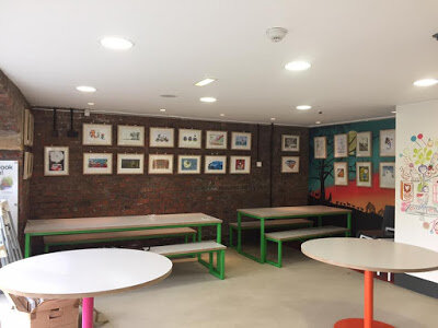 |
| The SCBWI BI Illustration Showcase at Seven Stories |
My artwork output has diversified this year and now includes Caricatures and Comics! Both as a result of doing Inkotber. I’ve done three Inktobers now and for Inktober2016 I wanted to do something a bit bigger to grow my audience. I thought I’d draw and ink a page of my comic manuscript everyday but realised how ambitious that would be in the timescale of a month. Instead I adapted Kate Bush’s song Under Ice into a 16 page, one panel per page, minicomic. I am a massive fan of Kate Bush and was lucky enough to go to a concert of hers during her 2014 residency at the Eventim Apollo. Under Ice is a song from a suite called the Ninth Wave on her 1985 album Hounds of Love. It is a very visual suite of songs that I interpret as being about a woman falling overboard a ship and slipping in and out of consciousness before she is finally rescued. Each song is either a dream or an account of what is happening. As you can see from my drawings, I imagine the song to be about Kate skating on a frozen river when it cracks and she falls in the water and dies, the ending sequence is her seeing herself under the ice and emerging as a spirit.