Creating A Children’s Picture Book Illustration Portfolio - Part 4 - Drawing Children

How do you draw children?  When creating a children’s picture book illustration portfolio, you need to have work that features children.  In a picture book, whether human, animal or robot, the main character is nearly always a child, this is something that I forgot to say in my blog post about format and content.  I have recently added these two new pieces to my portfolio and as you can see I have found it a challenge to make my characters look young, in fact it is difficult to work out what age they actually even are.    So, in this post, I aim to find out how to draw children.  
  
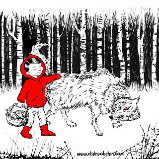
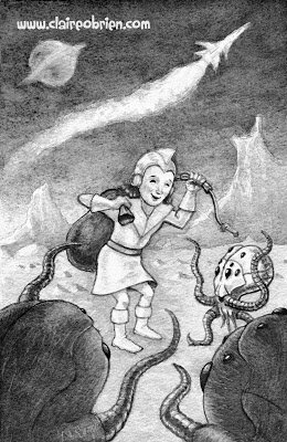
Red Meets The Wolf by Claire O'Brien

Bringing Home The Loot by Claire O'Brien


What Do The ‘How To’ Books Say About Drawing Children?
First port of call has to be some of the many ‘how to illustrate children’s picture books’ that are out there, to see what they advise about drawing children.


Observation
The consensus seems to be to observe children and draw them from life.  Uri Shulevitz says in his seminal Writing with Pictures: How to Write and Illustrate Children's Books
“It is best to draw from direct observation of nature - figures, landscapes, animals, plants, inanimate objects - as much as possible.  In this way you have clear references against which to compare and correct your drawings.  Artists who draw exclusively from imagination run the risk of drifting into vagueness.” (Shulevitz 1997, p136) 

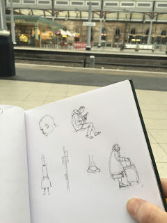
As always, this is good advice as it basically boils down to ‘learn how to draw by drawing’. Below are some of my observational drawings, this is something I do as much as I can.  From our observational drawings of children what do we learn about how make our own children character designs that we use in our picture books look more childlike? 


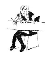
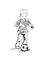
My own observational drawings

Scale - Proportion Charts
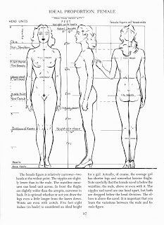
After observation, the first thing that strikes me about children is their size, they look small next to adults and everyday objects.  So let’s look at children’s proportional anatomy first.  I’m not keen on the proportion charts in ‘how to draw for children’s picture books’ they are not objective enough for me.  I find there are better proportion charts in regular ‘how to draw’ books though most just show the adult male, some do have charts for the adult female and a few show comparisons between the genders and ages.

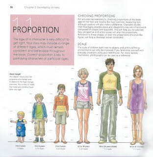
In my opinion, the most useful human anatomy proportion charts for Children’s Picture Book Illustrators are by Andrew Loomis.  We have to remember that proportion charts establish rules for an ‘ideal’ figure and are measured out using a unit that is relative to the size of the figure's head. Loomis' ideal is an adult of eight heads high, in reality the adult is probably seven and a half heads high.  The demarkation of where the eight head units fall on the body, line up with body landmarks such as the nipples, the navel, the elbows, etc and that helps us learn the proportions of the ideal figure. 


Loomis' adult male and female 'ideals' from Figure Drawing For All It's Worth


Beware when using some proportion charts, for example, while How to Draw Comics the Marvel Way is a great ‘how to draw’ book its eight head ideal proportion chart is a bit illogical to actually use, it has extra arbitrary proportion lines added at the neck and feet.


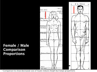
Also a lot of proportion charts state that women are seven and a half heads high to show that they are often shorter than men.  Again I prefer Loomis' method of an eight headed high female ideal.  Using seven and half heads makes it difficult to memorise where the subsequent head unit demarkations fall. I think the solution to drawing women shorter than men is to make their heads slightly smaller, as shown below, the red line shows the measurement of the women's head.  I might be wrong in doing this, what do you think?


Comparative Proportions
Okay so now that we are familiar with adult proportions how do they compare with children’s proportions? If we were to increase a child’s height to an adult’s we see instantly they have differently proportioned anatomy as the picture below shows.


As Loomis shows us below children's heads are smaller than adults' but they are larger in proportion to their own bodies. Children are not eight heads high, the numbers of head units vary at different ages starting with just 4 at one years old, 5 at three years old, 6 at five years old and 7 at ten years old. Arms and legs are relatively very short between one and three years old and he neck doesn't start showing until five when the shoulders start to widen. 


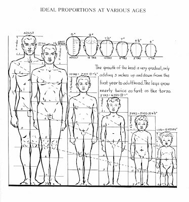
As well as covering whole body anatomy in Figure Drawing For All It's Worth Loomis goes into great detail about drawing babies, small children, school age children and teenagers' heads and hands in Drawing The Head And Hands.


From Further Reading
As well as Loomis' proportion charts there are some great written tips about drawing children;

In William Rimmer’s very unusual Art Anatomy book he gives this formula for drawing children:

  • Large head
  • Rounded cheeks
  • Short neck
  • High, narrow shoulders
  • Rounded abdomen
  • Narrow pelvis
  • Limbs large in proportion to small hands and feet

And in Barbara Bradley’s brilliant book Drawing People she says;
  • Babies' heads are very square both from the front and in profile.
  • Babies have a wider space between the eyes than adults.
  • Babies' cheeks reach down to the chin and sometimes farther.
  • Most babies have a lot of fat, it's pretty much gone by the time they are seven.
  • The curve under babies' chins is convex.
  • Missing teeth happen at around seven years old.
  • Babies have fat hands and feet.


My Own Observations
Here are my own observations I have made while drawing children from life, they have:


  • Large foreheads
  • Big eyes, wide apart
  • Transparent eyebrows
  • Upper lips that are more prominent than the lower
  • No lines or wrinkles on the face
  • No or a short neck
  • Chubbiness
  • Short arms
  • Big nappied-bottoms

Conclusion
So hopefully I have given you some useful things to think about and apply when drawing children for a children's picture book illustration portfolio, do let me know in the comments and also if you have anything to add.  I have certainly found this research useful and have made the following couple of watercolours as a result:

A two year old by Claire O'Brien

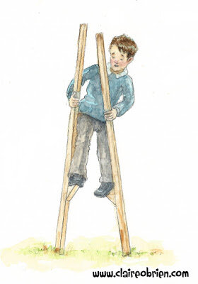
An eight year old by Claire O'Brien


Further Reading/Viewing

  • Check out Stan Prokopenko's Videos they are an essential guide to drawing human anatomy and proportion, and drawing in general.
  • This TEDx talk The Myth Of Average made me think of the 'ideal'. Just as the 'ideal' doesn't exist neither does average.  We all have a 'Jagged Size Profile' and this is something to bear in mind when drawing in individuality into our characters.
  • And finally, below, is a great real-life example of an Art Director, Lauren Rille, giving feedback on illustrator Robert Neubecker's initial illustrations on how to make the portrayed children more childlike in Sarah WeeksSophie Peterman Tells The Truth.


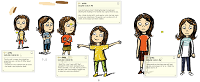
Lauren Rille's Feedback to Robert Neubecker on his initial Character Designs


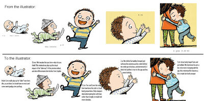
Lauren Rille's Feedback to Robert Neubecker on this Spread

SCBWI Workshop Report - Getting Your Picture Book onto the Page With Elizabeth Dulemba

Last weekend I escaped my duties as a Mother and took a train up to Edinburgh to join the South East Scotland SCBWI Network for a Picture Book Workshop with the wonderful Elizabeth O Dulemba.

Sketching at the station
Elizabeth is an amazing writer, illustrator and teacher from the US, who we are lucky to have access to here in the UK (and the North especially!) as she has recently moved to Edinburgh to further her studies. Watch her inspiring TEDx talk about how she sold or gave away nearly everything she owned to pursue her dreams. 


The Workshop

It was a really useful and productive workshop, with a mixture of exemplar picture books, story analysis, folding paper, lots of folding paper, writing, pitching and drawing.  There was a lot of information crammed in and I was surprised to find that by the end, I’d roughly storyboarded the manuscript that I took along.  It was a pleasure and enlightening to see the collection of professionals’ storyboards that Elizabeth showed.  I now want to check out the gorgeous work of Ruth Sanderson whom I was previously unfamiliar with, click on that link, you won’t be sorry that you did.  Elizabeth brought along some of her own picture book dummies (mock ups) which were exquisite.  Sadly we ran out of time at the end to make our own dummies but Elizabeth has a pdf resource on her website to help.

Folding a zine

My Storyboard
So what I will take away from the workshop is a way to look at my texts to define the essence of them, then break them down into four key structure parts, and from there into a further eight parts and then finally seeing them as a whole of 14 spreads/32 pages to eventually taking them to dummy for reading out loud and page turning in the real world.

Sociable SCBWIs

It was a fun-packed, educational time and as SCBWI’s are a sociable lot I joined them for a post-workshop drink to talk even more about children’s book writing and illustrating and despairing at how long it takes to succeed.  It was lovely to hear about Sheila Averbuch’s journey and her signing with her agent.  Sheila highly recommended doing Writer’s Digest courses with access to editors and agents so I’m strongly considering trying an appropriate one to me, if I do, I’m sure to report back.

Sociable SCBWIs - Rebecca Colby

I have written before here and here about how how friendly the world of children's literature is and I am going to do it again in this post.  Last month, when I asked my online friend, fellow SCBWI member and brilliant picture-book writer; Rebecca Colby, for some advice for things to do with kids in her hometown, she not only responded with some great ideas, we also decided to meet up and had a lovely time eating ice-cream and talking about writing.

Rebecca and I

I love Rebecca’s latest book "It's Raining Bats & Frogs", it is really well-written with some lovely poetic refrains and is a great example of picture book plotting.  I adore the art and have enjoyed reading illustrator Steve Henry’s blog posts on his working process on this book, covering concept design, final art and I especially love this post about layout.


For the aspiring children’s picture book authors and illustrators reading this, you must check out Rebecca’s guest Sub It Club blog post about querying agents.  She reads between the lines of her successful query letter for "It's Raining Bats & Frogs" to show what your letter is  actually saying to agents about you and your story.  It has certainly helped me craft my own query submissions. 


I know that we can expect a few more picture books from Rebecca in the future and you can also get her debut book "There Was a Wee Lassie Who Swallowed a Midgie" .  "It's Raining Bats & Frogs"
isn’t available in UK shops yet but it can be ordered pretty quickly from Amazon, I highly recommend it to you and if you get the chance to meet Rebecca, I recommend her too.


03 - Spread Of Wonder: The Robot and the Bluebird

Welcome to the third post in my ‘Spread Of Wonder’ series where I talk about spreads from picture books that I admire, I look at them and analyse why I think they make a good spread.  This month’s spread is the 10th spread of David Lucas’ “The Robot and the Bluebird” which was published in 2007 by Andersen Press.  


I do not know if David Lucas is a picture book superstar, but I personally, did not know of him until I recently came across this book in my local library.  It is a beautiful, whimsical story of an old, broken hearted robot who is put on the scrap heap but finds new purpose and friendship when he shelters a weak, migrating bluebird in the cavity where his heart used to be. It is illustrated with dip pen ink lines and coloured with watercolour, somewhat a traditional media in children's picture books.  


In this spread, the robot is at the hardest part of his journey, carrying the bird in his heart over a mountain.  He is moving left to right in direction, moving us through the story just as we have seen demonstrated in my previous choices of Spreads of Wonder.

What is great about this spread for me is how the illustration of the setting contributes to the storytelling.  The robot is crossing a mountain, a difficult thing to do at any time but even harder when it is raining and snowing like Lucas has drawn here.  Again Lucas uses direction in the diagonal lines of the falling rain and snow, pelting down against the robot's back.  Lucas has drawn grey thunder clouds that look like symbols from TV weather forecasts, with jagged arrowed, lightening coming from them, they are not soft and fluffy, they have hard outlines and their shading shows their solid form.  The mountains are also pointed and jagged, as are the trees with their icicle spikes and bare twig branches suggesting danger everywhere.

Lucas use uses a limited colour palette to great effect in this spread using only washes of blue, black and red against the white of the paper.  He uses the cool and muted blues, blacks and whites in the environment which contrasts starkly against the warm rust red of the robot.  Apart from the clouds, as already mentioned, and perhaps the robot, Lucas hasn't really used the colour to describe the form  of objects through shading, instead he applies colour as a bodycolour wash and uses the pen line to describe form.  This seems to be an often-used technique in children's picture book illustration and I wonder if it just adds to the clarity for children?    

What can the aspiring illustrator learn from this spread of wonder then?  This spread teaches us mainly about using illustration to contribute to storytelling. 

Storytelling - make the environment show the feelings of the story 
Direction - Use physical direction of the action to move the narrative forward, left to right and show hardship and struggle with right to left direction
Use Contrast of colour temperature to highlight a character.

Please comment with your own thoughts on this spread, or make a suggestion for a future Spread of Wonder candidate for me to analyse and don’t forget to follow this blog to receive a notification of my next post.  Thanks for reading! 

Promotion

I have had quite a fun-filled children’s book-related month so far, I have been to some promotional events, I have even been promoted myself and there are some great opportunities for more promotion to be had, not just for me but for other aspiring children’s picture book author and illustrators too!

Promotional Events
First up was Seven Stories’ Jodi Picoult talk and signing at the lovely Tyneside Cinema.  Jodi and her daughter, Samantha Van Leer, have co-written a YA (Young Adult) novel “Between the Lines” that is a book about a book, a fairytale book, with characters coming out of the page.  Jodi and Sammi gave a great talk, the pair of them in conversation, no compere!  The book also features striking illustrations by Yvonne Gilbert and enchanting silhouettes by Scott M. Fischer.  Let’s hope we see more YA novels with illustration adorning their pages in the future.


Next up was the launch of Gabrielle Kent’s Middle Grade novel “Alfie Bloom and the Secrets of Hexbridge Castle” at Stockton Library.  I’m so excited by the book because I’m a friend of Gabrielle. We met at Teesside University when she was my tutor and then, when I worked there, my colleague.  “Alfie Bloom and the Secrets of Hexbridge Castle” is her debut and it is the start of a series.  It was a lovely book launch with readings, signings and fun activities for children and Stockton Library looked like a really good libary.  I’m so pleased for Gabrielle and look forward to seeing how her writing career turns out and I know she is cheering me on in my own writing endeavours.


The last of the events that I went to were some illustrator talks that kicked off The Festival of Illustration in Hartlepool.  The talks that I attended were great, they were by Chris Riddell, John McCrea (comic artist) and Sara Ogilvie. The festival has been well-organised by Cleveland College of Art and Design and the main illustration exhibition and is held in the beautiful former church, Hartlepool Art Gallery.  The exhibition runs between the 4th June to the 4th July and it is well worth a look (and a second visit from me) as it features some top illustrators all-round and as well as children’s picture book illustrators.   I attended with some SCBWI friends and it was nice to meet Chris Riddell, little did we know he was about to become the Children’s Laureate, check out his five point plan for the role. 

 
Left to Right: Lucy Farfort, Claire O'Brien, Maureen Lynas,
Chris Riddell, Cathy Brumby and Katherine Lynas

Chris Riddell by Claire O'Brien 


Promotion of Me
This month saw the release of my first ever interview!  It was for the brilliant Kidlit TV who have featured me as their Community Member of the Month for June.  KidlitTV is a great community and YouTube channel that features original Kidlit content, particularly fantastic interviews with authors and illustrators in their ‘Story Makers’ series (a title I came up with).  As well as providing great content, the Facebook group is a mine of information about video creation and marketing, so if you make videos, you need to join.


SCBWI has launched a new email magazine INSIGHT, every month there is a drawing prompt for members, everyone who submits gets included in the gallery and two are picked to be featured in the email itself.  This email will reach agents and editors so it is worth submitting to.  You can see my entry for the ‘Bounce’ prompt here, leave me comment if you look.


Let’s Get Promoted
I have already mentioned being featured in SCBWI’s Draw This prompt, this month’s prompt is ‘Adventure’, here are the guidelines if you’re a SCBWI member and wish to submit, but hurry, the deadline is June 20th.

Another SCBWI opportunity is Undiscovered Voices, a competition for unpublished and unagented children's book writers and illustrators living in the EU.  Submissions are open on the 1st of July and close on the 16th August.  The illustration criteria give the opportunity for drawing some twisted fairy tales 

Here’s a contest to win a critique from talented illustrator, teacher and YouTuber Will Terry and $30 credit to his SVS online courses by submitting an illustration to the prompt of: “Amanda was so excited for her first day at the cottage until…”.  The deadline is 12:00 noon EST, June 25th.

And just for fun and cool prizes there is Susannah Hill’s illustration contest on the theme of Discovery, you have until the 26t of June to submit.

Good luck with these if you enter, why don’t you post a link if you do, I’d love to see.  Thanks for reading.