Creating A Children’s Picture Book Illustration Portfolio - Part 4 - Drawing Children

How do you draw children?  When creating a children’s picture book illustration portfolio, you need to have work that features children.  In a picture book, whether human, animal or robot, the main character is nearly always a child, this is something that I forgot to say in my blog post about format and content.  I have recently added these two new pieces to my portfolio and as you can see I have found it a challenge to make my characters look young, in fact it is difficult to work out what age they actually even are.    So, in this post, I aim to find out how to draw children.  
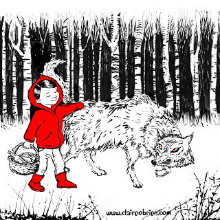
  
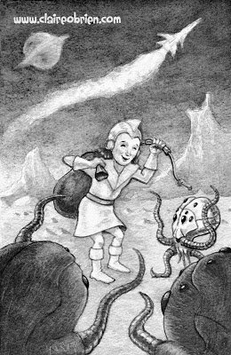
Red Meets The Wolf by Claire O'Brien

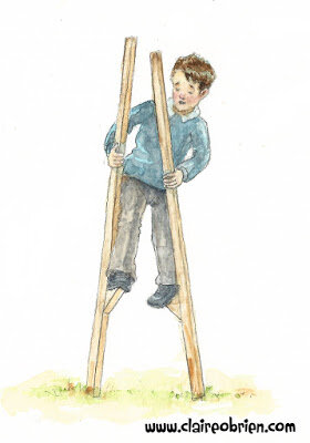
Bringing Home The Loot by Claire O'Brien


What Do The ‘How To’ Books Say About Drawing Children?
First port of call has to be some of the many ‘how to illustrate children’s picture books’ that are out there, to see what they advise about drawing children.


Observation
The consensus seems to be to observe children and draw them from life.  Uri Shulevitz says in his seminal Writing with Pictures: How to Write and Illustrate Children's Books
“It is best to draw from direct observation of nature - figures, landscapes, animals, plants, inanimate objects - as much as possible.  In this way you have clear references against which to compare and correct your drawings.  Artists who draw exclusively from imagination run the risk of drifting into vagueness.” (Shulevitz 1997, p136) 

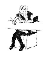
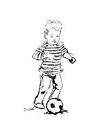
As always, this is good advice as it basically boils down to ‘learn how to draw by drawing’. Below are some of my observational drawings, this is something I do as much as I can.  From our observational drawings of children what do we learn about how make our own children character designs that we use in our picture books look more childlike? 


My own observational drawings

Scale - Proportion Charts
After observation, the first thing that strikes me about children is their size, they look small next to adults and everyday objects.  So let’s look at children’s proportional anatomy first.  I’m not keen on the proportion charts in ‘how to draw for children’s picture books’ they are not objective enough for me.  I find there are better proportion charts in regular ‘how to draw’ books though most just show the adult male, some do have charts for the adult female and a few show comparisons between the genders and ages.

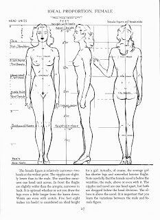
In my opinion, the most useful human anatomy proportion charts for Children’s Picture Book Illustrators are by Andrew Loomis.  We have to remember that proportion charts establish rules for an ‘ideal’ figure and are measured out using a unit that is relative to the size of the figure's head. Loomis' ideal is an adult of eight heads high, in reality the adult is probably seven and a half heads high.  The demarkation of where the eight head units fall on the body, line up with body landmarks such as the nipples, the navel, the elbows, etc and that helps us learn the proportions of the ideal figure. 


Loomis' adult male and female 'ideals' from Figure Drawing For All It's Worth


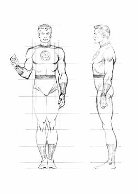
Beware when using some proportion charts, for example, while How to Draw Comics the Marvel Way is a great ‘how to draw’ book its eight head ideal proportion chart is a bit illogical to actually use, it has extra arbitrary proportion lines added at the neck and feet.


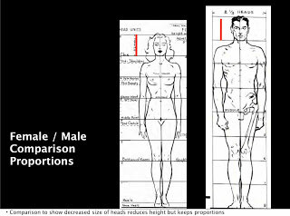
Also a lot of proportion charts state that women are seven and a half heads high to show that they are often shorter than men.  Again I prefer Loomis' method of an eight headed high female ideal.  Using seven and half heads makes it difficult to memorise where the subsequent head unit demarkations fall. I think the solution to drawing women shorter than men is to make their heads slightly smaller, as shown below, the red line shows the measurement of the women's head.  I might be wrong in doing this, what do you think?


Comparative Proportions
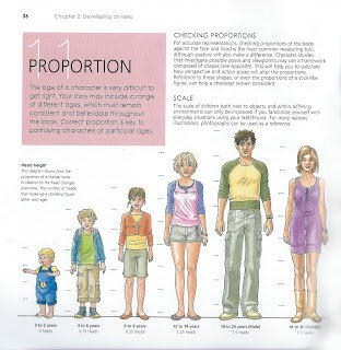
Okay so now that we are familiar with adult proportions how do they compare with children’s proportions? If we were to increase a child’s height to an adult’s we see instantly they have differently proportioned anatomy as the picture below shows.


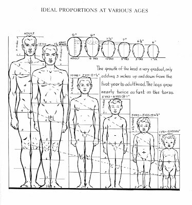
As Loomis shows us below children's heads are smaller than adults' but they are larger in proportion to their own bodies. Children are not eight heads high, the numbers of head units vary at different ages starting with just 4 at one years old, 5 at three years old, 6 at five years old and 7 at ten years old. Arms and legs are relatively very short between one and three years old and he neck doesn't start showing until five when the shoulders start to widen. 


As well as covering whole body anatomy in Figure Drawing For All It's Worth Loomis goes into great detail about drawing babies, small children, school age children and teenagers' heads and hands in Drawing The Head And Hands.


From Further Reading
As well as Loomis' proportion charts there are some great written tips about drawing children;

In William Rimmer’s very unusual Art Anatomy book he gives this formula for drawing children:

  • Large head
  • Rounded cheeks
  • Short neck
  • High, narrow shoulders
  • Rounded abdomen
  • Narrow pelvis
  • Limbs large in proportion to small hands and feet

And in Barbara Bradley’s brilliant book Drawing People she says;
  • Babies' heads are very square both from the front and in profile.
  • Babies have a wider space between the eyes than adults.
  • Babies' cheeks reach down to the chin and sometimes farther.
  • Most babies have a lot of fat, it's pretty much gone by the time they are seven.
  • The curve under babies' chins is convex.
  • Missing teeth happen at around seven years old.
  • Babies have fat hands and feet.


My Own Observations
Here are my own observations I have made while drawing children from life, they have:


  • Large foreheads
  • Big eyes, wide apart
  • Transparent eyebrows
  • Upper lips that are more prominent than the lower
  • No lines or wrinkles on the face
  • No or a short neck
  • Chubbiness
  • Short arms
  • Big nappied-bottoms

Conclusion
So hopefully I have given you some useful things to think about and apply when drawing children for a children's picture book illustration portfolio, do let me know in the comments and also if you have anything to add.  I have certainly found this research useful and have made the following couple of watercolours as a result:

A two year old by Claire O'Brien

An eight year old by Claire O'Brien


Further Reading/Viewing

  • Check out Stan Prokopenko's Videos they are an essential guide to drawing human anatomy and proportion, and drawing in general.
  • This TEDx talk The Myth Of Average made me think of the 'ideal'. Just as the 'ideal' doesn't exist neither does average.  We all have a 'Jagged Size Profile' and this is something to bear in mind when drawing in individuality into our characters.
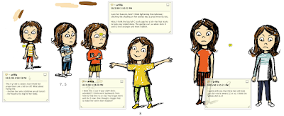
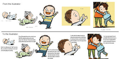
  • And finally, below, is a great real-life example of an Art Director, Lauren Rille, giving feedback on illustrator Robert Neubecker's initial illustrations on how to make the portrayed children more childlike in Sarah WeeksSophie Peterman Tells The Truth.


Lauren Rille's Feedback to Robert Neubecker on his initial Character Designs


Lauren Rille's Feedback to Robert Neubecker on this Spread

Creating A Children’s Picture Book Illustration Portfolio - Tips for Improving Your Portfolio - Part 3

This post continues my series about creating a children’s picture book illustration portfolio. First I covered quantity and quality and then I covered format and content. In this post I dig deeper into content and suggest some tips and tools for improving your work, I start by showing the new work I have added to my portfolio (if you just want the tips scroll down to the end of this post):

"The Four Seater", Gouache by Claire O'Brien

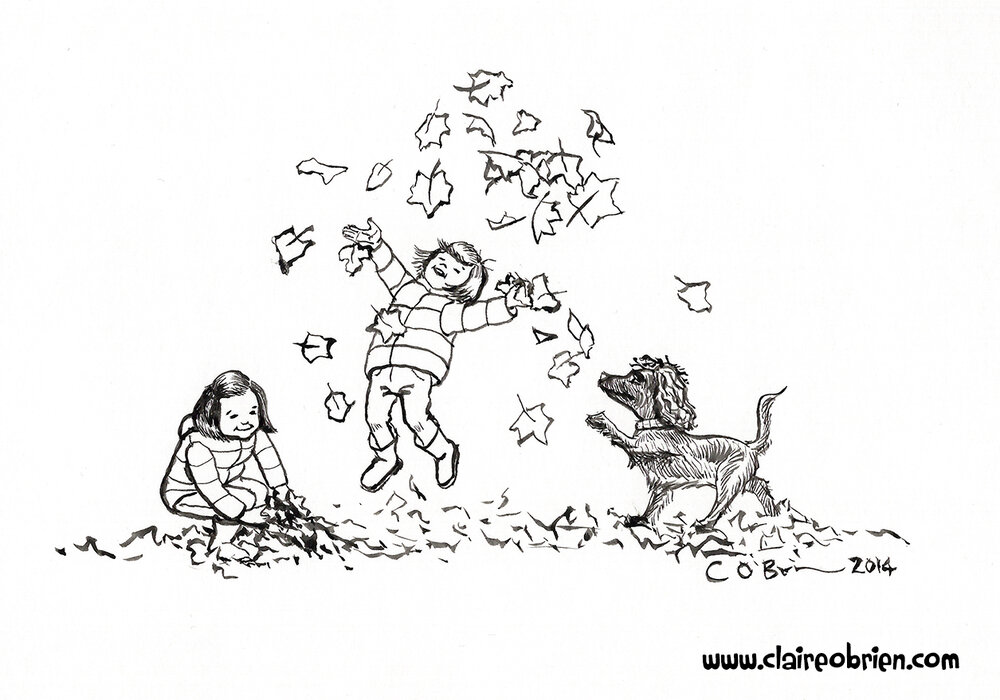
"Laughter in the Leaves" Ink by Claire O'Brien


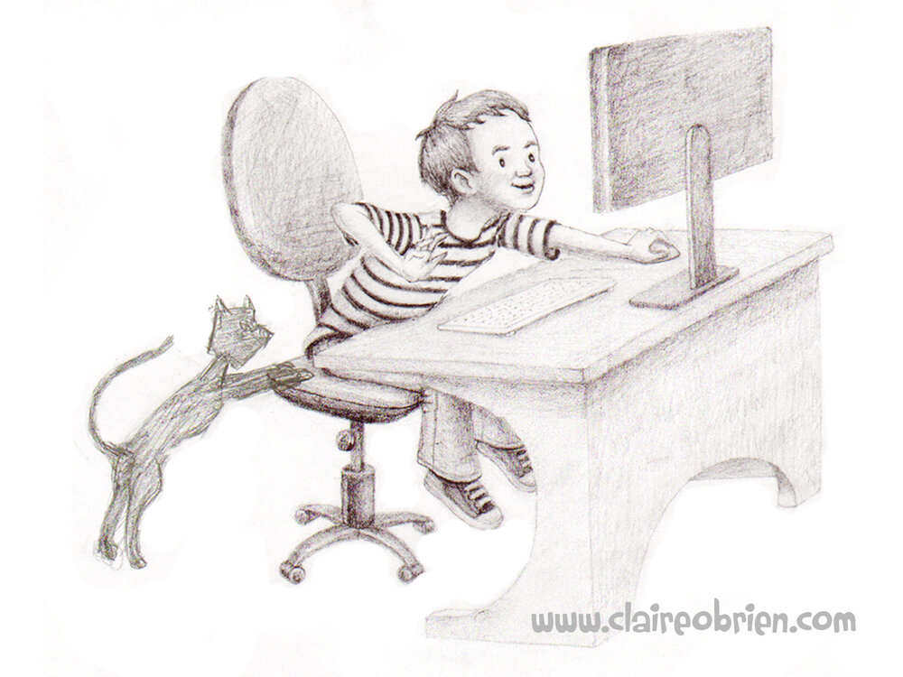
"Boy at the Computer" Pencil by Claire O'Brien
"Boy at the Computer" Pencil by Claire O'Brien 

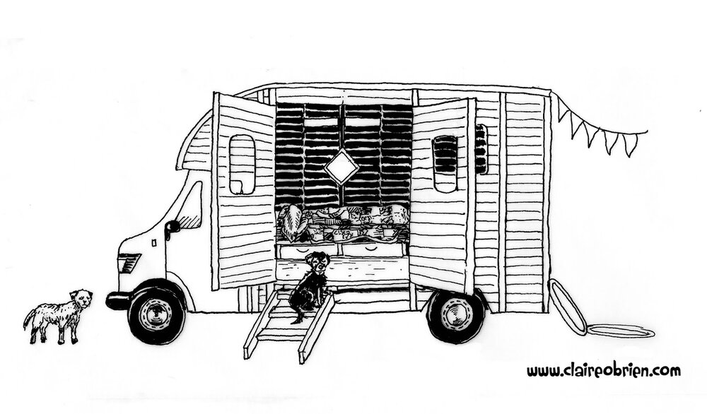
"Horsebox" Ink by Claire O'Brien
"Horsebox" Ink by Claire O'Brien 


In previous posts I established that my aims are to:
  • Produce work in a landscape format.
  • Produce consistent looking sequential images that feature characters doing different actions and showing different emotions.
  • Include more settings/backgrounds (move away from white backgrounds)

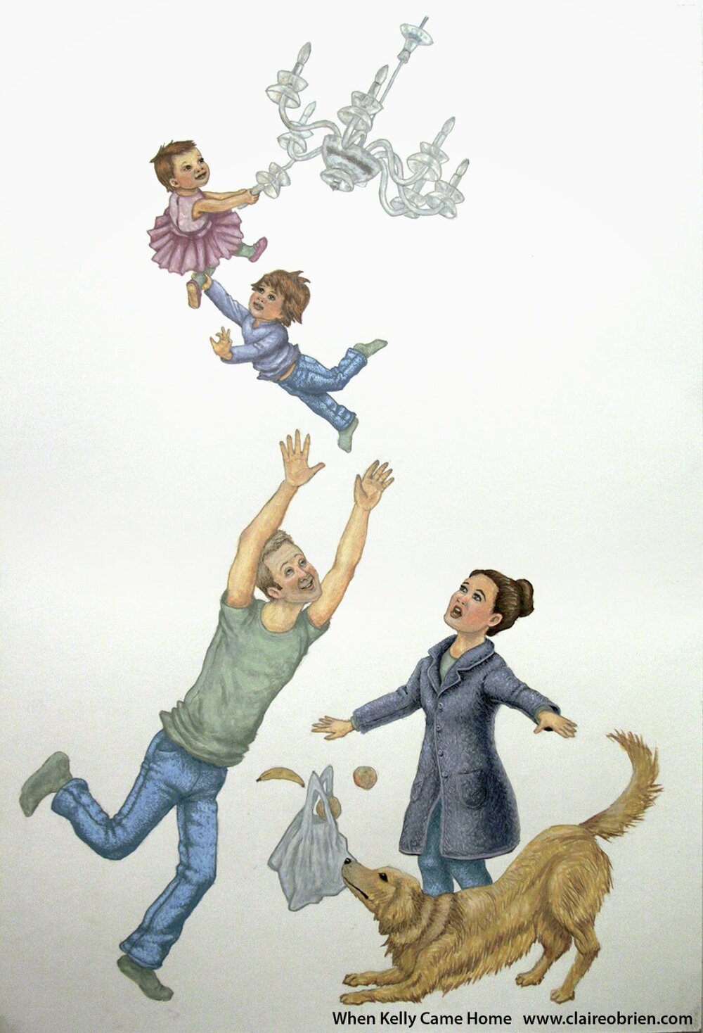
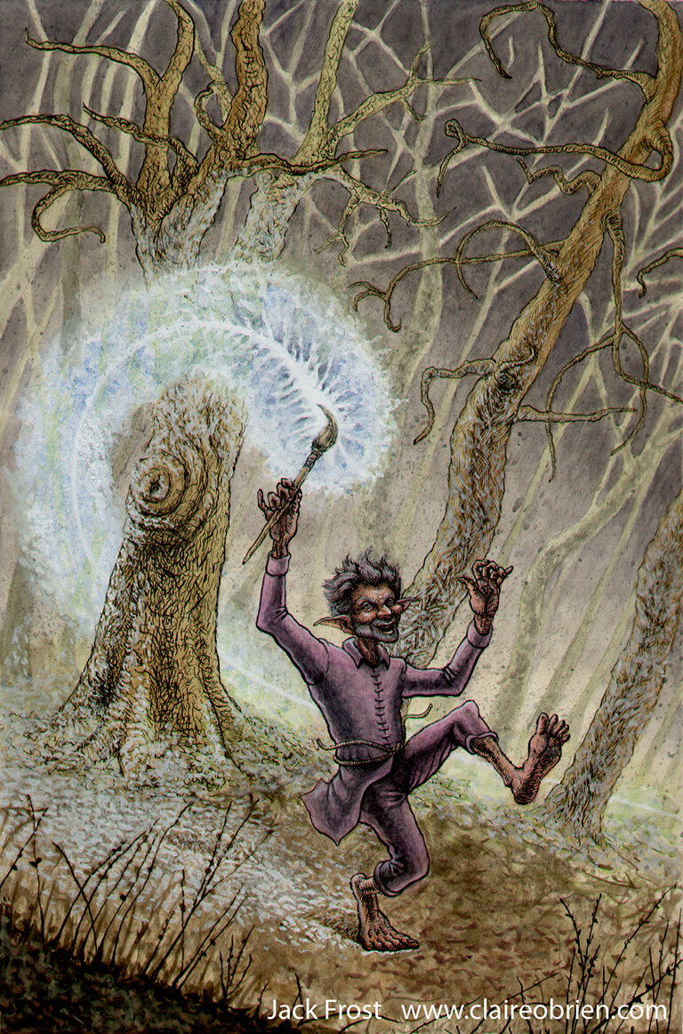
I have removed “When Mum Came Back”  because it is in portrait format and on a white background.  I have removed Jack Frost as, though it has a background, it is in portrait format and is too ‘Fantasy’ to stay (I may remake this image one day, as I would like to try and the capture a winter scene and the Jack Frost character more successfully and in a children’s picture book style).

“When Mum Came Back” Gouache by Claire O'Brien
"Jack Frost" Ink and Watercolour by Claire O'Brien
"Jack Frost" Ink and Watercolour by Claire O'Brien 

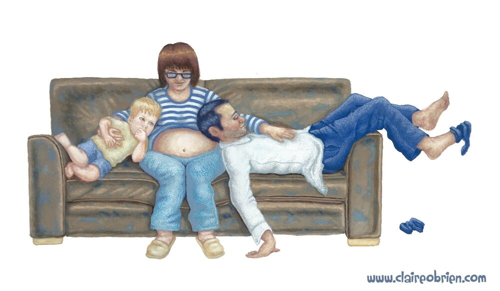
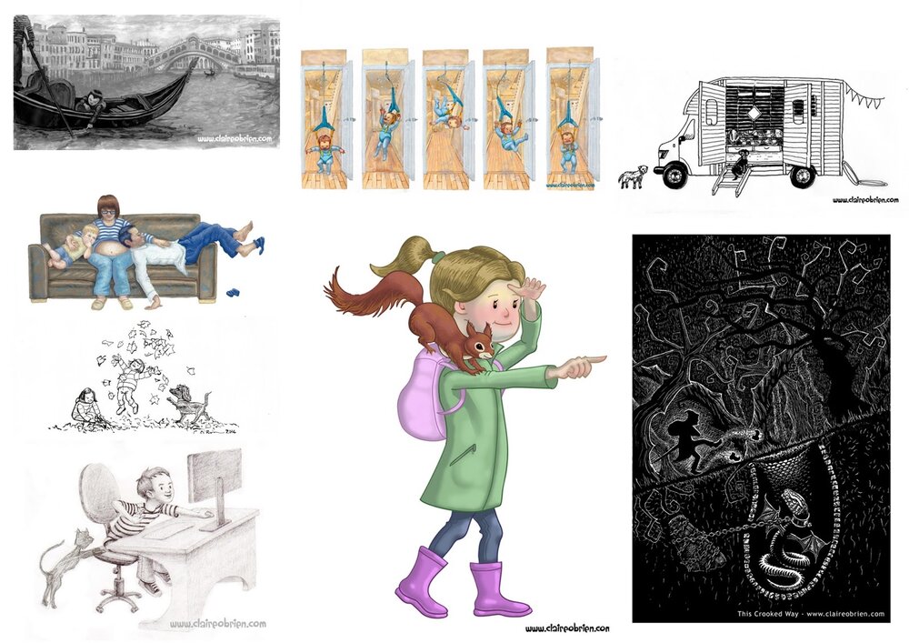
As a result of these changes, I have increased the quantity of my portfolio from six images to eight and hopefully raised the quality too.  The majority of the images are in landscape format now but I must aim for all of them to be.  The new illustrations don’t add enough action, the dogs in the horse box, the family on the sofa and the boy at the desk are all at static and at rest really.  Only the girls laughing in the leaves are mid-action. I’m not sure if I have successfully shown different emotion yet too with the new work, there is joy in the girls in the leaves and tiredness of the family on the sofa but neither of these are sequential which help show a change in their emotions.  Unfortunately there are no background settings in the new pictures so I have actually added more white space! 

My Portfolio at a Glance by Claire O'Brien


What tips will help me, and you, improve our portfolios?  Here are three suggestions:

Make Lots of Work! 
The more work you make, the more chances you’ll have of increasing the size and quality of your portfolio.  If the standard of your work is not yet portfolio-ready, making lots of work gets the bad stuff out, as Disney animator and drawing teacher, Walt Stanchfield said: 

“We all have 10,000 bad drawings in us. The sooner we get them out the better”.  

Making lots of work helps you practice your craft, you can only improve!  If you are stuck with what to make work about, draw from life so you do not rely on your style and what you think things look like, again this can only improve your work.


Look At The Best Work Currently Being Published!
Analyse what the illustrators and designers are doing in a children's picture book spread so that you can emulate it in your own work.  Look at the backgrounds, are the characters in white space or in a fully illustrated setting?  What sort of settings come up a lot?  Where are the characters placed in the spread?  Does it change depending on viewpoint? Long shots, closeups, bird’s eye views, etc. What are the characters doing? What do their poses, gestures and movement directions show us about what is happening in the story?  Does the character’s pose and expression convey an emotion?  Does the lighting echo the emotion, add to the mood?  Where has the illustrator left space for the text? Is it a white space or a quiet part of the illustration?  Is the illustration in duet with the text, showing what the text says or is it counterpoint and saying something different? 


Evaluate And Be Critical About Your Own Work!
Look at your work as a whole, add all of your portfolio images into one document and look at them on the screen or in a print out.  What stands out? Is it for good reasons or bad?  What similarities are there?  Look at the viewpoints you have used, where is your camera? Is it always close, far away, straight on?.  What are your backgrounds like?  Non existent like mine or fully realised?  Do you always use the same colour palette?  Is it always saturated or muted? Do your characters always face the front or the side but never anywhere in-between?  Are they always making the same pose or expression?  Do your characters look different to each other? Are they the same gender or age?  If all these things are similar, draw them differently to show variety and skill in your work.


Well, I still feel my portfolio does not quite fit the bill of a children’s picture book portfolio yet.  I’m going to follow my own tips and really focus on creating sequential images that feature characters doing different actions and showing different emotions in a background!  I’m also going to start a series of monthly posts called “Spread of Wonder” where I’ll present an example of a published children’s picture book spread that I admire and tell you why I think it is so great, follow my blog so that you get a notification of when I post it. And if you are stuck for what to actually draw check out these great suggestions from Robin Rosenthal.

New Year's Resolutions

Well it has been one year since I actively started blogging so I thought my first post of 2015 should be a review of 2014 and establish some New Year Resolutions.  In my very first post I stated that my aims were to document my quest of becoming a picture book Author and Illustrator, I still haven’t made it as an Author and Illustrator yet as it requires a lot of hard work, so this blog will continue along those lines again this year.

So what did I achieve last year? 

  • I completed Dr Mira Reisberg's Children's Book Academy course on writing children's picture books where I came out with my best manuscript so far and an illustration for its first spread which went on to be selected for the 2014 SCBWI BI Illustration Showcase.  This was a goal I set for myself here
  • I took part in Julie Hedlund's 12 x 12 challenge to write twelve picture book drafts in one year, one per month.  I didn’t quite manage twelve, more like six which is better than nothing.  It was really worthwhile doing it, the community there is great and they share their knowledge.  I’ve enrolled again this year too, at Gold level, eek!
  • I successfully completed PiBoIdMo, Tara Lazar's Picture Book Idea Month which runs in November where the challenge is to come up with 30 picture book ideas in the 30 days of November.  So I have 30 more ideas in the bank than I did before.
  • The most daring thing I have done this year was submit a manuscript to two agents.  One via a pitching webinar and the other via #PITMAD on Twitter.  Both came back as rejections, one with feedback too.  I’m not as discouraged about it as I thought I would be and I am looking forward to making more submissions soon.
  • I’m still a member of SCBWI, the Society of Children's Books Writers and Illustrators, and I attend my supportive SCBWI crit group once a month at Seven Stories.  Once of the group was taken on by an agent so I’m looking forward to seeing how that develops.
  • I released a free Picture Book Template for Scrivener and an accompanying video on YouTube which have been well-received and they have certainly raised the profile of my online platform.
  • I was a member of the CBI, the Children's Book Insider, a paid subscription website and Facebook group all about writing children's books.  I didn’t renew my membership this year, if I am honest their website was a bit of a let down for me as I found that lots of their pages were randomly offline and the Facebook group was mainly full of members’ self promotion.
  • New web adventures have included a few of my blog posts being featured in the SCBWI British Isles online magazine Words and Pictures.  And I loved getting my weekly email from Kidlit411, it’s so full of useful information to children’s authors and illustrators as is KidLitTV (I had the honour of naming their programme “Storymakers”).
  • Regarding learning and working on my craft I have been using Craftsy, Linda.com, Skillshare and Udemy videos and the brilliant Path to Publishing with The Plot Whisperer, Martha Alderson and Agent, Jill Corcoran.
  • Oh I went to the hottest ticket gig of the century when I went to see Kate Bush at her residency at the Hammersmith Apollo.  It was so amazing and inspiring, words don't do it justice, I'm still thinking about it!

Kate Bush - Before The Dawn - Claire O'Brien
Kate Bush - Before The Dawn - 2014


My New Year’s resolutions are to:

  • Improve my portfolio via my critical findings
  • Write more manuscripts and improve my writing craft
  • Increase the frequency of my blogging, post at least 18 posts this year.
  • Submit to agents with an aim of representation
  • Produce more videos and develop my YouTube channel 
  • Read more picture books
I wish you all the best with your own resolutions and I hope to see you back here soon.

Creating A Children’s Picture Book Illustration Portfolio - Format and Content - What to Put In? - Part 2

In my first post on the subject of Creating A Children’s Picture Book Illustration Portfolio I talked about the quantity and quality of the images.  In this post I’d like to explore format and content, by that I mean what the actual images show and how they are presented.  I will use my findings to create action points for me to apply to my own portfolio as it presently stands.

The Format of Children’s Picture Book Illustrations
Based on my observation of current children’s picture books, illustrations destined for the printed page are mostly printed in landscape format, spanning double page spreads.  In the past we saw more of single spread images and spot images and these are useful if you need more than the allocated 32 pages to tell the story.  

The Content of Children’s Picture Book Illustrations
Illustrations in children’s picture books are sequential in that they have multiple images that tell a story that happens over time.  This means that there is a requirement to be consistent in their execution, characters have to be ‘on model’, that is they have to have the same proportions and features and wear the same clothes from page to page (unless the story dictates otherwise).  Colours have to match from image to image.  Locations and props also need to be consistent in the same way.  Sequential storytelling art by its nature shows characters doing lots of actions and having different emotions and feelings.  And again, unless the story demands it, the art is produced in a consistent same style and medium. 

Appraising the Format and Content of the Work in My Own Portfolio
Okay, here is what my portfolio currently looks like, as whole, as seen on my website:

Claire O'Brien Art Portfolio

Disregarding its quality, I have a minimum desired quantity of six illustrations, of mainly human subjects, painted traditionally with gouache on paper.  I also have a digital piece, an ink and watercolour and a scraperboard.  

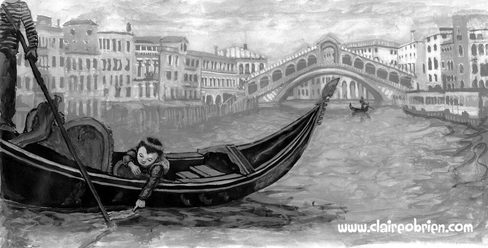
Venice Children's Picture Book Art Claire O'Brien


This is a tonal gouache sketch of a spread from one of my picture books that I am working on.  I think it is the strongest piece of work in my portfolio as it is has storytelling and is in a complete setting that conveys mood and atmosphere.  This has been affirmed to me by its selection in the 2014 SCBWI (British Isles) Showcase Exhibition a goal that I expressed a wish to achieve back in July when I helped to hang the 2013 Showcase at Seven Stories.

Children's Picture Book Art Claire O'Brien


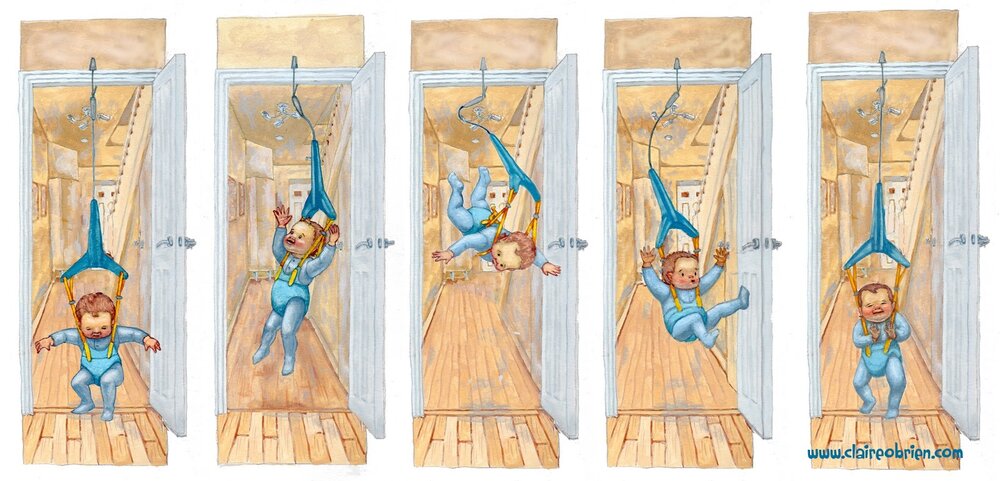
Baby Bouncer is painted in gouache with a touch of digital, set in an interior setting, it hopefully shows consistency in depicting a character and is sequential showing different emotions and action.

Claire O'Brien Art


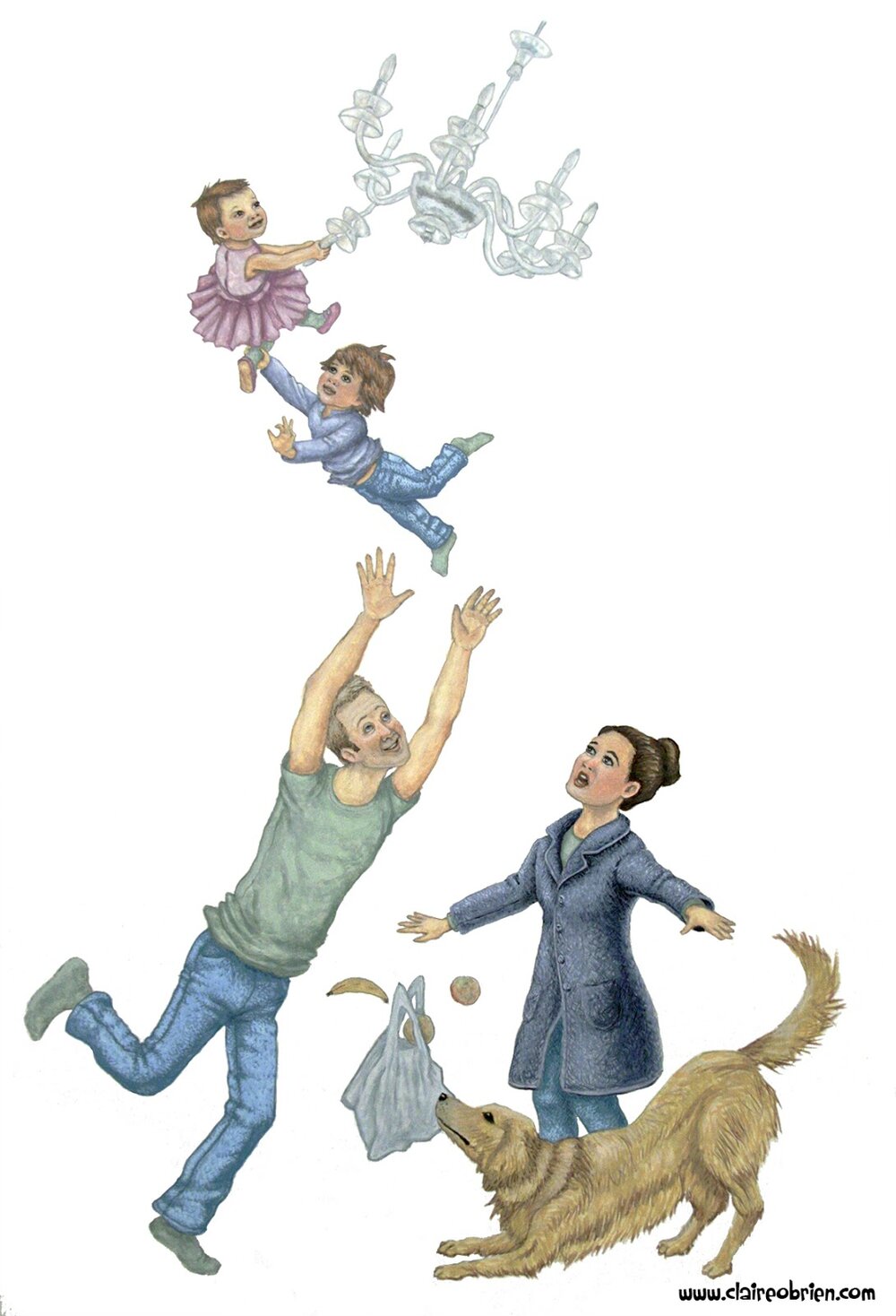
When Mum Came Back is a gouache showing a group in exaggerated action, with different emotions.

Children's Picture Book Art Claire O'Brien


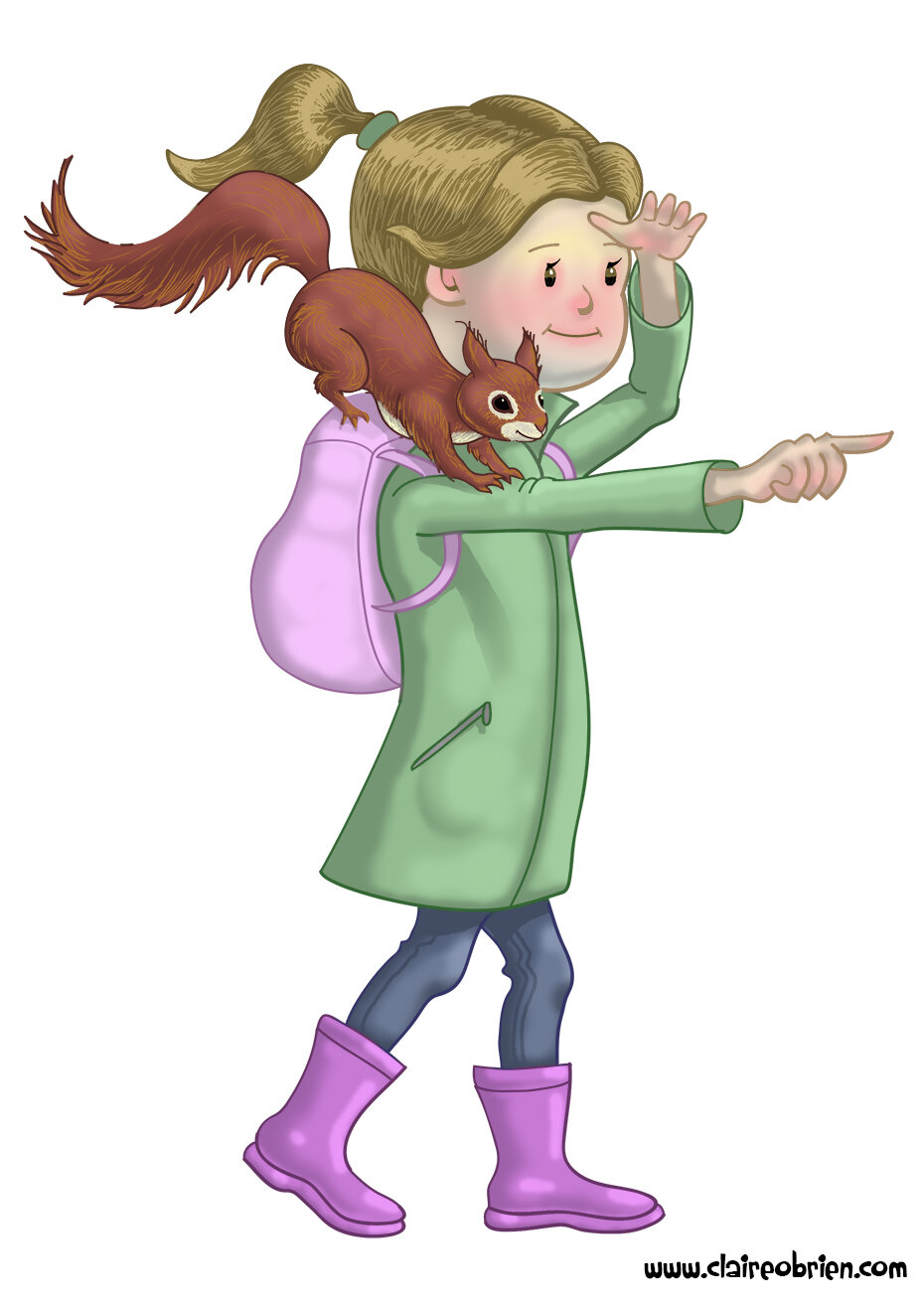
Outdoor Girl and Sidekick is me trying to capture my gouache style digitally.  I like the characters but I'm not sure of their emotions here, they're perhaps a bit neutral.

Jack Frost Art Claire O'Brien


Jack Frost is painted with ink and watecolour and is me attempting to draw like Arthur Rackham. Things in favour of this illustration are that is set in a forest setting and I like the rendering of the body.  The storytelling not quite there and the aesthetic is perhaps more fantasy than picture book. 

Art Claire O'Brien


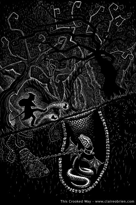
This Crooked Way is a scraperboard and I like the design style dictated by the medium, but it would need refining if I were to do more of these.   Again perhaps the aesthetic is more fantasy than picture book.

Action Points
So here are my conclusions about the format and content of my children's picture book illustration portfolio and some suggested action points to implement in order to improve it, who knows they may apply to your own portfolio:
  • Produce future work in landscape format.
  • Produce consistent looking sequential images that show characters doing different actions and showing different emotions.
  • Include more settings/backgrounds (move away from white backgrounds)

Further Reading
Here are some good links to what others have to say about children's picture book illustration portfolios:
  • Lynne Chapman's professional view on character and characterisation
  • Donald Wu gives his professional opinion for ordering your portfolio and good advice on style and content.
  • Eliza Wheeler shares her SCBWI feedback on improving her portfolio.

#Inktober - The Benefits of Participating in an Online Challenge

Inktober is a drawing challenge to make one ink drawing a day for the entire month of October.  Inktober was started in 2009 by an artist called Jake Parker, who set himself the challenge to improve his inking skills and develop positive drawing habits.  This, 2014, is the first year that I have taken part in it and my own motives were similar to Jake’s, they were:

    • to get better at drawing with ink
    • to produce a drawing a day
    • to generate images for my Facebook art page

I am pleased to say that I completed the challenge as this video of my Inktober drawings shows:


So what were the benefits of doing this?  Firstly in my work, I got comfortable drawing with ink, without a pencil sketch as a foundation.  My main discovery is that it’s best to draw what is closest to you first, that which overlaps on your subject rather than starting with the general large shapes as you would when drawing in pencil.  This one touch way of drawing was scary but liberating.  I found it easier than I thought to produce a drawing a day, so much so that I plan on keeping the habit up, but not necessarily using just ink. The challenge also served the purpose of content for my Facebook art page and Twitter and Google + too.  The drawings were often of things I did that day so they became like a journal.

There were benefits to doing Inktober in Social Media rather than just through my blog or website.  I don’t currently have many likes for my art page (just under 150) so these numbers won’t sound impressive but according to Facebook I had at least 50 to 200 people seeing individual drawings.  I’m not sure how many saw them on Twitter and Google +.  I would on average get 6 likes per drawing Facebook, a couple of favourites on Twitter and a couple of +1s on Google +.  The Facebook and Google + likes and +1s tended to be from friends and acquaintances but strangers favourited on Twitter.  Best of all I have been approached to produce some prints of some of the drawings and commissioned to make a drawing in my “Inktober” style.

Some lessons learned are that:

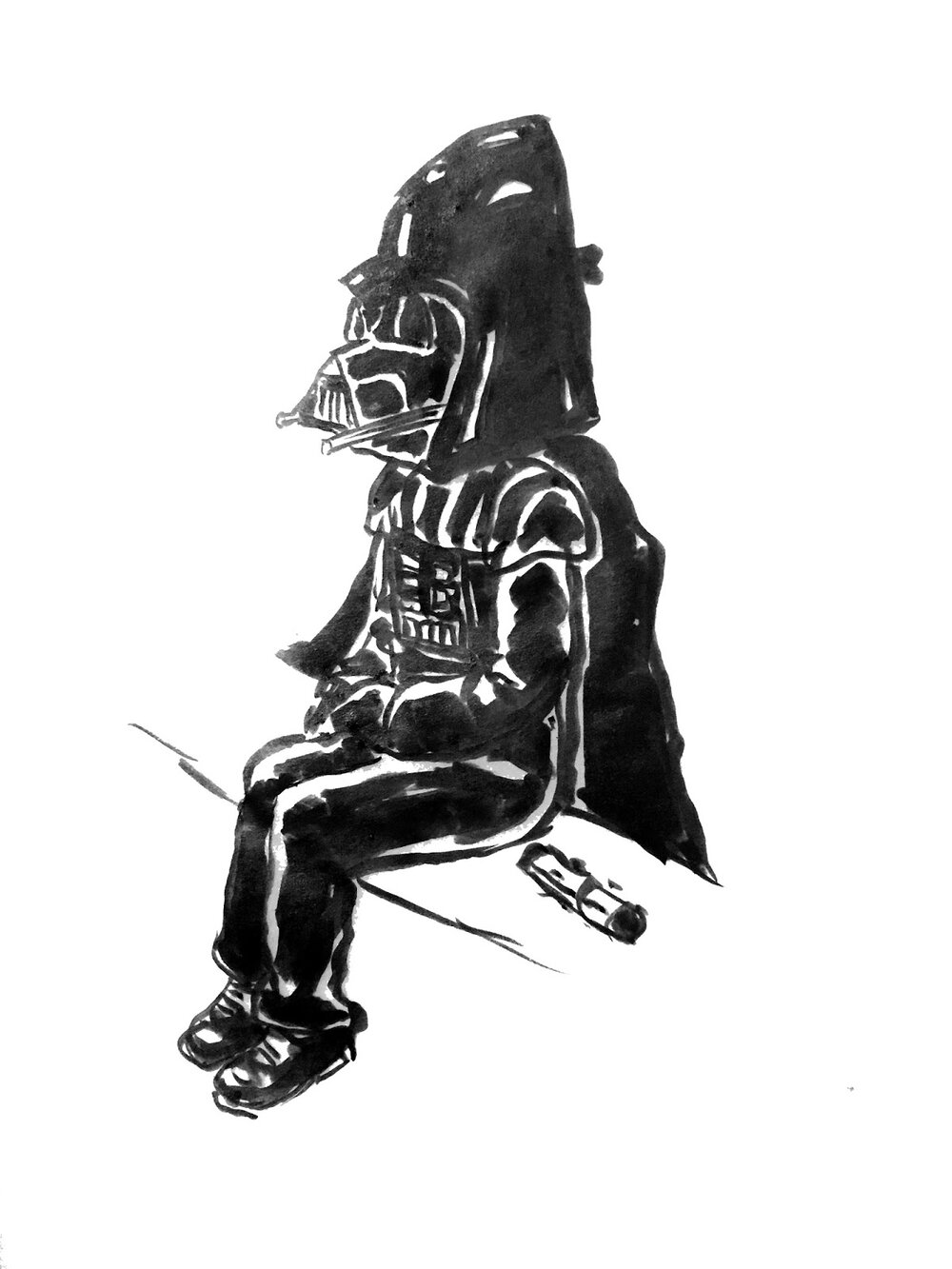
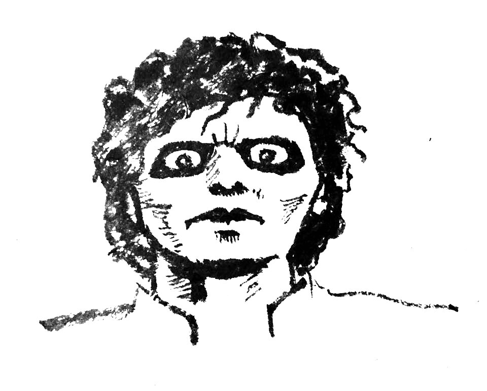
    • Popular drawings were the ones that feature pop culture such Day 11 of my son dressed as Darth Vader and Day 28 of Michael Jackson in Thriller.  

    • Two hash tags (including #inktober) in Twitter would often get retweets and favourites. Tweeting someone specifically generally didn’t.
    • Next time I will embed File Info from Photoshop rather than uploading from my phone and I will include a visible URL back to me as some images have turned up on various blogs and have been shared.

So overall it was a really worthwhile challenge and I will definitely do it again next year.  Next up is Tara Lazar’s PiBoIdMo - Picture Book Idea Month.