Tips For Doing Caricature Gigs

I have recently added Caricaturing to my repertoire as an artist, I have had two gigs so far and I'd like to share with you what I have learnt from doing them.

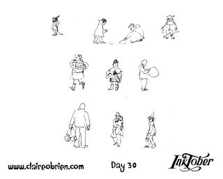
First of all I am not doing the really exaggerated, highly rendered kind of caricature drawing like

Jason Seiler

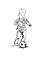
 for example. My ‘caricatures’ are black ink line drawings of the people who sit in front of me, drawn as a representational portrait or portraying them as popular person or character of their choosing.  

I did not plan to start caricaturing, I did it on a whim, I decided to run a caricature stall at the school-where-I-work-at’s Summer Fair, just for fun to see if I could actually do it and to raise some money in the process.  As it was the first time I have ever done anything like this I was very nervous at whether I would get recognisable likenesses, be fast enough and be good enough.  I think what gave me the confidence to try is the legacy of taking part in

Inktober

where you aim to make an ink drawing every day in the month of October, as a result I haven’t stopped near-daily drawing since taking part for the first time three years ago.  

So at the school’s Summer Fair I set up a stall which consisted of an easel displaying some sample caricatures that I had made earlier and a banner saying ‘caricatures’ and the price of a drawing.  I had an easel to draw at, a chair for me and a chair for the sitter.  I made sure I had plenty of paper, pens and at the last minute I grabbed a pencil with a rubber on.  For requests of whom to be drawn as I used an iPad to Google for images. 

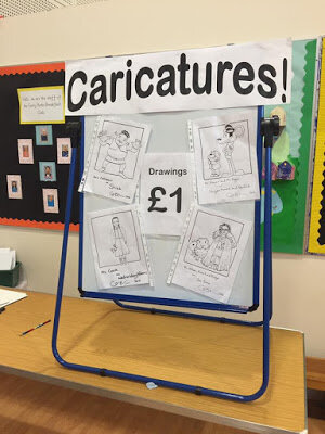
School Fair Caricature Setup

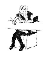
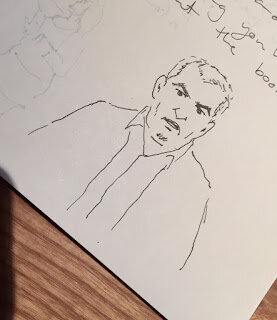
When the first guests arrived I asked if anyone wanted a drawing and immediately someone took me up on the offer.  After that there was a crowd around me from every angle and an unorganised queue formed.  I drew in pencil lines first then inked over them with Posca markers.  I drew nine portraits in an hour and a half.  The thin pen I favoured ran out towards the end and I had to switch to my thicker one.  The rubber on my pencil wore down and for the last couple of drawings I asked the sitter to rub the pencil out when they got home.  

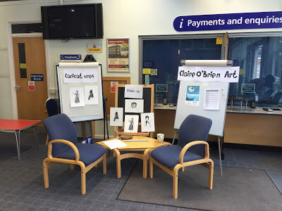
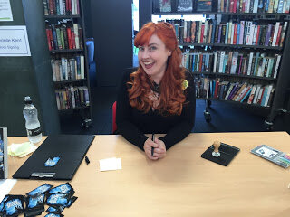
Birtley Library Caricature Setup

I learnt some great lessons from doing this which helped me in my second gig at my first ever Library event as part of

Geek Con 3

at

Birtley Library

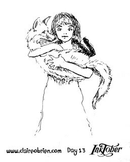
.  I kept a similar physical setup but also displayed some prints for sale (See below for the Bellatrix Lestrange portrait I made especially to sell at the event).  I felt more confident this time and decided to ditch the pencil and drew straight away in pen, this time my favourite Pentel Pocket Brush pen, this, of course, helped me create more time to make more drawings.  To avoid a chaotic queue and any disappointment at not getting a drawing, I had a time slot sheet which I managed to keep to.  So my second caricature gig was even more successful than the first and I am making arrangements for my third gig next month.  Here’s my Bellatrix Lestrange caricature below:

Creating A Children’s Picture Book Illustration Portfolio - Part 4 - Drawing Children

How do you draw children?  When creating a children’s picture book illustration portfolio, you need to have work that features children.  In a picture book, whether human, animal or robot, the main character is nearly always a child, this is something that I forgot to say in my blog post about format and content.  I have recently added these two new pieces to my portfolio and as you can see I have found it a challenge to make my characters look young, in fact it is difficult to work out what age they actually even are.    So, in this post, I aim to find out how to draw children.  
  
Red Meets The Wolf by Claire O'Brien

Bringing Home The Loot by Claire O'Brien


What Do The ‘How To’ Books Say About Drawing Children?
First port of call has to be some of the many ‘how to illustrate children’s picture books’ that are out there, to see what they advise about drawing children.


Observation
The consensus seems to be to observe children and draw them from life.  Uri Shulevitz says in his seminal Writing with Pictures: How to Write and Illustrate Children's Books
“It is best to draw from direct observation of nature - figures, landscapes, animals, plants, inanimate objects - as much as possible.  In this way you have clear references against which to compare and correct your drawings.  Artists who draw exclusively from imagination run the risk of drifting into vagueness.” (Shulevitz 1997, p136) 

As always, this is good advice as it basically boils down to ‘learn how to draw by drawing’. Below are some of my observational drawings, this is something I do as much as I can.  From our observational drawings of children what do we learn about how make our own children character designs that we use in our picture books look more childlike? 


My own observational drawings

Scale - Proportion Charts
After observation, the first thing that strikes me about children is their size, they look small next to adults and everyday objects.  So let’s look at children’s proportional anatomy first.  I’m not keen on the proportion charts in ‘how to draw for children’s picture books’ they are not objective enough for me.  I find there are better proportion charts in regular ‘how to draw’ books though most just show the adult male, some do have charts for the adult female and a few show comparisons between the genders and ages.

In my opinion, the most useful human anatomy proportion charts for Children’s Picture Book Illustrators are by Andrew Loomis.  We have to remember that proportion charts establish rules for an ‘ideal’ figure and are measured out using a unit that is relative to the size of the figure's head. Loomis' ideal is an adult of eight heads high, in reality the adult is probably seven and a half heads high.  The demarkation of where the eight head units fall on the body, line up with body landmarks such as the nipples, the navel, the elbows, etc and that helps us learn the proportions of the ideal figure. 


Loomis' adult male and female 'ideals' from Figure Drawing For All It's Worth


Beware when using some proportion charts, for example, while How to Draw Comics the Marvel Way is a great ‘how to draw’ book its eight head ideal proportion chart is a bit illogical to actually use, it has extra arbitrary proportion lines added at the neck and feet.


Also a lot of proportion charts state that women are seven and a half heads high to show that they are often shorter than men.  Again I prefer Loomis' method of an eight headed high female ideal.  Using seven and half heads makes it difficult to memorise where the subsequent head unit demarkations fall. I think the solution to drawing women shorter than men is to make their heads slightly smaller, as shown below, the red line shows the measurement of the women's head.  I might be wrong in doing this, what do you think?


Comparative Proportions
Okay so now that we are familiar with adult proportions how do they compare with children’s proportions? If we were to increase a child’s height to an adult’s we see instantly they have differently proportioned anatomy as the picture below shows.


As Loomis shows us below children's heads are smaller than adults' but they are larger in proportion to their own bodies. Children are not eight heads high, the numbers of head units vary at different ages starting with just 4 at one years old, 5 at three years old, 6 at five years old and 7 at ten years old. Arms and legs are relatively very short between one and three years old and he neck doesn't start showing until five when the shoulders start to widen. 


As well as covering whole body anatomy in Figure Drawing For All It's Worth Loomis goes into great detail about drawing babies, small children, school age children and teenagers' heads and hands in Drawing The Head And Hands.


From Further Reading
As well as Loomis' proportion charts there are some great written tips about drawing children;

In William Rimmer’s very unusual Art Anatomy book he gives this formula for drawing children:

  • Large head
  • Rounded cheeks
  • Short neck
  • High, narrow shoulders
  • Rounded abdomen
  • Narrow pelvis
  • Limbs large in proportion to small hands and feet

And in Barbara Bradley’s brilliant book Drawing People she says;
  • Babies' heads are very square both from the front and in profile.
  • Babies have a wider space between the eyes than adults.
  • Babies' cheeks reach down to the chin and sometimes farther.
  • Most babies have a lot of fat, it's pretty much gone by the time they are seven.
  • The curve under babies' chins is convex.
  • Missing teeth happen at around seven years old.
  • Babies have fat hands and feet.


My Own Observations
Here are my own observations I have made while drawing children from life, they have:


  • Large foreheads
  • Big eyes, wide apart
  • Transparent eyebrows
  • Upper lips that are more prominent than the lower
  • No lines or wrinkles on the face
  • No or a short neck
  • Chubbiness
  • Short arms
  • Big nappied-bottoms

Conclusion
So hopefully I have given you some useful things to think about and apply when drawing children for a children's picture book illustration portfolio, do let me know in the comments and also if you have anything to add.  I have certainly found this research useful and have made the following couple of watercolours as a result:

A two year old by Claire O'Brien

An eight year old by Claire O'Brien


Further Reading/Viewing

  • Check out Stan Prokopenko's Videos they are an essential guide to drawing human anatomy and proportion, and drawing in general.
  • This TEDx talk The Myth Of Average made me think of the 'ideal'. Just as the 'ideal' doesn't exist neither does average.  We all have a 'Jagged Size Profile' and this is something to bear in mind when drawing in individuality into our characters.
  • And finally, below, is a great real-life example of an Art Director, Lauren Rille, giving feedback on illustrator Robert Neubecker's initial illustrations on how to make the portrayed children more childlike in Sarah WeeksSophie Peterman Tells The Truth.


Lauren Rille's Feedback to Robert Neubecker on his initial Character Designs


Lauren Rille's Feedback to Robert Neubecker on this Spread

October / Inktober 2015

October is my favourite month of the year as it is my birthday month and because of Halloween, I just love spooky things.  I’ve been working on some portfolio pieces and this one is appropriate for the season; a witch taking a night flight as a swarm of bats spirals by.

Night Flight by Claire O'Brien
Night Flight by Claire O'Brien, 2015, gouache on paper


I took part in #Inktober again this year.  Just to recap, Inktober is a drawing challenge to make one ink drawing a day for the entire month of October.  Inktober was started in 2009 by an artist called Jake Parker, who set himself the challenge to improve his inking skills and develop positive drawing habits.  I am pleased to say that I made a drawing every day except for the last.  

Doing Inktober was as fun as last year, I even took some requests this year for subjects to draw which added to the challenge. Inktober really motivated me to draw every day and the quality of drawings ranged from throwaway sketches to not bad, I even sold some prints and have been commissioned to draw in my ink style.

You can see all of my Inktober drawings on my Facebook page but here are are some of my highlights:

"Playing in the Garden" by Claire O'Brien

"The Gentleman" by Claire O'Brien

"I Found a Fox" by Claire O'Brien

"Kate Bush - Before The Dawn" by Claire O'Brien
"Halloween" by Claire O'Brien

There was also lovely a meet up of some sociable SCBWIs, Top, 2016 Carnegie long-listed, YA author Teri Terry was in town for writing research so a gang of us had dinner and viewed the SCBWI Illustration Showcase exhibition at Seven Stories.

Geoff Lynas, Maureen Lynas and Janet Foxley outside of Seven Stories

Teri Terry, Geoff Lynas, and Maureen Lynas

"Maureen and Teri" by Claire O'Brien

Up month is Tara Lazar's PiBoIdMo - Picture Book Idea Month a where you come up with an idea for a picture book every day of November.  


Promotion

I have had quite a fun-filled children’s book-related month so far, I have been to some promotional events, I have even been promoted myself and there are some great opportunities for more promotion to be had, not just for me but for other aspiring children’s picture book author and illustrators too!

Promotional Events
First up was Seven Stories’ Jodi Picoult talk and signing at the lovely Tyneside Cinema.  Jodi and her daughter, Samantha Van Leer, have co-written a YA (Young Adult) novel “Between the Lines” that is a book about a book, a fairytale book, with characters coming out of the page.  Jodi and Sammi gave a great talk, the pair of them in conversation, no compere!  The book also features striking illustrations by Yvonne Gilbert and enchanting silhouettes by Scott M. Fischer.  Let’s hope we see more YA novels with illustration adorning their pages in the future.


Next up was the launch of Gabrielle Kent’s Middle Grade novel “Alfie Bloom and the Secrets of Hexbridge Castle” at Stockton Library.  I’m so excited by the book because I’m a friend of Gabrielle. We met at Teesside University when she was my tutor and then, when I worked there, my colleague.  “Alfie Bloom and the Secrets of Hexbridge Castle” is her debut and it is the start of a series.  It was a lovely book launch with readings, signings and fun activities for children and Stockton Library looked like a really good libary.  I’m so pleased for Gabrielle and look forward to seeing how her writing career turns out and I know she is cheering me on in my own writing endeavours.


The last of the events that I went to were some illustrator talks that kicked off The Festival of Illustration in Hartlepool.  The talks that I attended were great, they were by Chris Riddell, John McCrea (comic artist) and Sara Ogilvie. The festival has been well-organised by Cleveland College of Art and Design and the main illustration exhibition and is held in the beautiful former church, Hartlepool Art Gallery.  The exhibition runs between the 4th June to the 4th July and it is well worth a look (and a second visit from me) as it features some top illustrators all-round and as well as children’s picture book illustrators.   I attended with some SCBWI friends and it was nice to meet Chris Riddell, little did we know he was about to become the Children’s Laureate, check out his five point plan for the role. 

 
Left to Right: Lucy Farfort, Claire O'Brien, Maureen Lynas,
Chris Riddell, Cathy Brumby and Katherine Lynas

Chris Riddell by Claire O'Brien 


Promotion of Me
This month saw the release of my first ever interview!  It was for the brilliant Kidlit TV who have featured me as their Community Member of the Month for June.  KidlitTV is a great community and YouTube channel that features original Kidlit content, particularly fantastic interviews with authors and illustrators in their ‘Story Makers’ series (a title I came up with).  As well as providing great content, the Facebook group is a mine of information about video creation and marketing, so if you make videos, you need to join.


SCBWI has launched a new email magazine INSIGHT, every month there is a drawing prompt for members, everyone who submits gets included in the gallery and two are picked to be featured in the email itself.  This email will reach agents and editors so it is worth submitting to.  You can see my entry for the ‘Bounce’ prompt here, leave me comment if you look.


Let’s Get Promoted
I have already mentioned being featured in SCBWI’s Draw This prompt, this month’s prompt is ‘Adventure’, here are the guidelines if you’re a SCBWI member and wish to submit, but hurry, the deadline is June 20th.

Another SCBWI opportunity is Undiscovered Voices, a competition for unpublished and unagented children's book writers and illustrators living in the EU.  Submissions are open on the 1st of July and close on the 16th August.  The illustration criteria give the opportunity for drawing some twisted fairy tales 

Here’s a contest to win a critique from talented illustrator, teacher and YouTuber Will Terry and $30 credit to his SVS online courses by submitting an illustration to the prompt of: “Amanda was so excited for her first day at the cottage until…”.  The deadline is 12:00 noon EST, June 25th.

And just for fun and cool prizes there is Susannah Hill’s illustration contest on the theme of Discovery, you have until the 26t of June to submit.

Good luck with these if you enter, why don’t you post a link if you do, I’d love to see.  Thanks for reading.

Creating A Children’s Picture Book Illustration Portfolio - Tips for Improving Your Portfolio - Part 3

This post continues my series about creating a children’s picture book illustration portfolio. First I covered quantity and quality and then I covered format and content. In this post I dig deeper into content and suggest some tips and tools for improving your work, I start by showing the new work I have added to my portfolio (if you just want the tips scroll down to the end of this post):

"The Four Seater", Gouache by Claire O'Brien

"Laughter in the Leaves" Ink by Claire O'Brien


"Boy at the Computer" Pencil by Claire O'Brien
"Boy at the Computer" Pencil by Claire O'Brien 

"Horsebox" Ink by Claire O'Brien
"Horsebox" Ink by Claire O'Brien 


In previous posts I established that my aims are to:
  • Produce work in a landscape format.
  • Produce consistent looking sequential images that feature characters doing different actions and showing different emotions.
  • Include more settings/backgrounds (move away from white backgrounds)

I have removed “When Mum Came Back”  because it is in portrait format and on a white background.  I have removed Jack Frost as, though it has a background, it is in portrait format and is too ‘Fantasy’ to stay (I may remake this image one day, as I would like to try and the capture a winter scene and the Jack Frost character more successfully and in a children’s picture book style).

“When Mum Came Back” Gouache by Claire O'Brien
"Jack Frost" Ink and Watercolour by Claire O'Brien
"Jack Frost" Ink and Watercolour by Claire O'Brien 

As a result of these changes, I have increased the quantity of my portfolio from six images to eight and hopefully raised the quality too.  The majority of the images are in landscape format now but I must aim for all of them to be.  The new illustrations don’t add enough action, the dogs in the horse box, the family on the sofa and the boy at the desk are all at static and at rest really.  Only the girls laughing in the leaves are mid-action. I’m not sure if I have successfully shown different emotion yet too with the new work, there is joy in the girls in the leaves and tiredness of the family on the sofa but neither of these are sequential which help show a change in their emotions.  Unfortunately there are no background settings in the new pictures so I have actually added more white space! 

My Portfolio at a Glance by Claire O'Brien


What tips will help me, and you, improve our portfolios?  Here are three suggestions:

Make Lots of Work! 
The more work you make, the more chances you’ll have of increasing the size and quality of your portfolio.  If the standard of your work is not yet portfolio-ready, making lots of work gets the bad stuff out, as Disney animator and drawing teacher, Walt Stanchfield said: 

“We all have 10,000 bad drawings in us. The sooner we get them out the better”.  

Making lots of work helps you practice your craft, you can only improve!  If you are stuck with what to make work about, draw from life so you do not rely on your style and what you think things look like, again this can only improve your work.


Look At The Best Work Currently Being Published!
Analyse what the illustrators and designers are doing in a children's picture book spread so that you can emulate it in your own work.  Look at the backgrounds, are the characters in white space or in a fully illustrated setting?  What sort of settings come up a lot?  Where are the characters placed in the spread?  Does it change depending on viewpoint? Long shots, closeups, bird’s eye views, etc. What are the characters doing? What do their poses, gestures and movement directions show us about what is happening in the story?  Does the character’s pose and expression convey an emotion?  Does the lighting echo the emotion, add to the mood?  Where has the illustrator left space for the text? Is it a white space or a quiet part of the illustration?  Is the illustration in duet with the text, showing what the text says or is it counterpoint and saying something different? 


Evaluate And Be Critical About Your Own Work!
Look at your work as a whole, add all of your portfolio images into one document and look at them on the screen or in a print out.  What stands out? Is it for good reasons or bad?  What similarities are there?  Look at the viewpoints you have used, where is your camera? Is it always close, far away, straight on?.  What are your backgrounds like?  Non existent like mine or fully realised?  Do you always use the same colour palette?  Is it always saturated or muted? Do your characters always face the front or the side but never anywhere in-between?  Are they always making the same pose or expression?  Do your characters look different to each other? Are they the same gender or age?  If all these things are similar, draw them differently to show variety and skill in your work.


Well, I still feel my portfolio does not quite fit the bill of a children’s picture book portfolio yet.  I’m going to follow my own tips and really focus on creating sequential images that feature characters doing different actions and showing different emotions in a background!  I’m also going to start a series of monthly posts called “Spread of Wonder” where I’ll present an example of a published children’s picture book spread that I admire and tell you why I think it is so great, follow my blog so that you get a notification of when I post it. And if you are stuck for what to actually draw check out these great suggestions from Robin Rosenthal.