Tips For Doing Caricature Gigs

I have recently added Caricaturing to my repertoire as an artist, I have had two gigs so far and I'd like to share with you what I have learnt from doing them.

First of all I am not doing the really exaggerated, highly rendered kind of caricature drawing like

Jason Seiler

 for example. My ‘caricatures’ are black ink line drawings of the people who sit in front of me, drawn as a representational portrait or portraying them as popular person or character of their choosing.  

I did not plan to start caricaturing, I did it on a whim, I decided to run a caricature stall at the school-where-I-work-at’s Summer Fair, just for fun to see if I could actually do it and to raise some money in the process.  As it was the first time I have ever done anything like this I was very nervous at whether I would get recognisable likenesses, be fast enough and be good enough.  I think what gave me the confidence to try is the legacy of taking part in

Inktober

where you aim to make an ink drawing every day in the month of October, as a result I haven’t stopped near-daily drawing since taking part for the first time three years ago.  

So at the school’s Summer Fair I set up a stall which consisted of an easel displaying some sample caricatures that I had made earlier and a banner saying ‘caricatures’ and the price of a drawing.  I had an easel to draw at, a chair for me and a chair for the sitter.  I made sure I had plenty of paper, pens and at the last minute I grabbed a pencil with a rubber on.  For requests of whom to be drawn as I used an iPad to Google for images. 
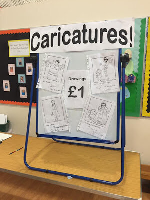
School Fair Caricature Setup

When the first guests arrived I asked if anyone wanted a drawing and immediately someone took me up on the offer.  After that there was a crowd around me from every angle and an unorganised queue formed.  I drew in pencil lines first then inked over them with Posca markers.  I drew nine portraits in an hour and a half.  The thin pen I favoured ran out towards the end and I had to switch to my thicker one.  The rubber on my pencil wore down and for the last couple of drawings I asked the sitter to rub the pencil out when they got home.  

Birtley Library Caricature Setup

I learnt some great lessons from doing this which helped me in my second gig at my first ever Library event as part of

Geek Con 3

at

Birtley Library

.  I kept a similar physical setup but also displayed some prints for sale (See below for the Bellatrix Lestrange portrait I made especially to sell at the event).  I felt more confident this time and decided to ditch the pencil and drew straight away in pen, this time my favourite Pentel Pocket Brush pen, this, of course, helped me create more time to make more drawings.  To avoid a chaotic queue and any disappointment at not getting a drawing, I had a time slot sheet which I managed to keep to.  So my second caricature gig was even more successful than the first and I am making arrangements for my third gig next month.  Here’s my Bellatrix Lestrange caricature below:

Creating A Children’s Picture Book Illustration Portfolio - Part 4 - Drawing Children

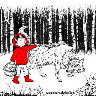
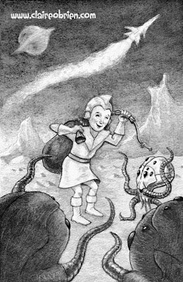
How do you draw children?  When creating a children’s picture book illustration portfolio, you need to have work that features children.  In a picture book, whether human, animal or robot, the main character is nearly always a child, this is something that I forgot to say in my blog post about format and content.  I have recently added these two new pieces to my portfolio and as you can see I have found it a challenge to make my characters look young, in fact it is difficult to work out what age they actually even are.    So, in this post, I aim to find out how to draw children.  
  
Red Meets The Wolf by Claire O'Brien

Bringing Home The Loot by Claire O'Brien


What Do The ‘How To’ Books Say About Drawing Children?
First port of call has to be some of the many ‘how to illustrate children’s picture books’ that are out there, to see what they advise about drawing children.


Observation
The consensus seems to be to observe children and draw them from life.  Uri Shulevitz says in his seminal Writing with Pictures: How to Write and Illustrate Children's Books
“It is best to draw from direct observation of nature - figures, landscapes, animals, plants, inanimate objects - as much as possible.  In this way you have clear references against which to compare and correct your drawings.  Artists who draw exclusively from imagination run the risk of drifting into vagueness.” (Shulevitz 1997, p136) 

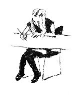
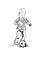
As always, this is good advice as it basically boils down to ‘learn how to draw by drawing’. Below are some of my observational drawings, this is something I do as much as I can.  From our observational drawings of children what do we learn about how make our own children character designs that we use in our picture books look more childlike? 


My own observational drawings

Scale - Proportion Charts
After observation, the first thing that strikes me about children is their size, they look small next to adults and everyday objects.  So let’s look at children’s proportional anatomy first.  I’m not keen on the proportion charts in ‘how to draw for children’s picture books’ they are not objective enough for me.  I find there are better proportion charts in regular ‘how to draw’ books though most just show the adult male, some do have charts for the adult female and a few show comparisons between the genders and ages.

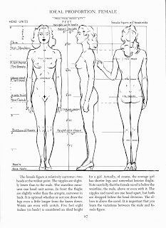
In my opinion, the most useful human anatomy proportion charts for Children’s Picture Book Illustrators are by Andrew Loomis.  We have to remember that proportion charts establish rules for an ‘ideal’ figure and are measured out using a unit that is relative to the size of the figure's head. Loomis' ideal is an adult of eight heads high, in reality the adult is probably seven and a half heads high.  The demarkation of where the eight head units fall on the body, line up with body landmarks such as the nipples, the navel, the elbows, etc and that helps us learn the proportions of the ideal figure. 


Loomis' adult male and female 'ideals' from Figure Drawing For All It's Worth


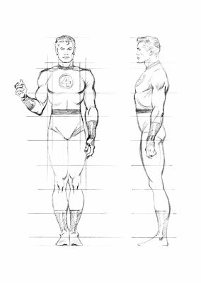
Beware when using some proportion charts, for example, while How to Draw Comics the Marvel Way is a great ‘how to draw’ book its eight head ideal proportion chart is a bit illogical to actually use, it has extra arbitrary proportion lines added at the neck and feet.


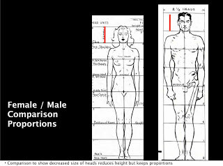
Also a lot of proportion charts state that women are seven and a half heads high to show that they are often shorter than men.  Again I prefer Loomis' method of an eight headed high female ideal.  Using seven and half heads makes it difficult to memorise where the subsequent head unit demarkations fall. I think the solution to drawing women shorter than men is to make their heads slightly smaller, as shown below, the red line shows the measurement of the women's head.  I might be wrong in doing this, what do you think?


Comparative Proportions
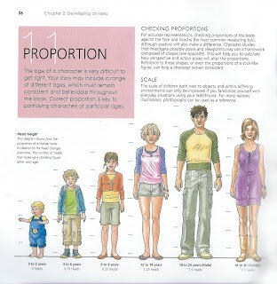
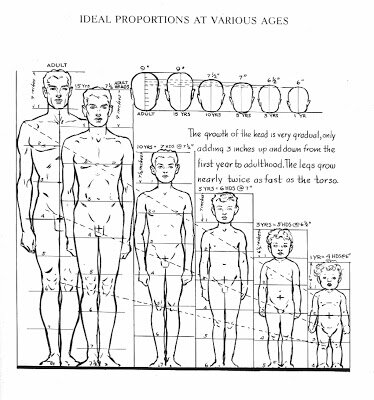
Okay so now that we are familiar with adult proportions how do they compare with children’s proportions? If we were to increase a child’s height to an adult’s we see instantly they have differently proportioned anatomy as the picture below shows.


As Loomis shows us below children's heads are smaller than adults' but they are larger in proportion to their own bodies. Children are not eight heads high, the numbers of head units vary at different ages starting with just 4 at one years old, 5 at three years old, 6 at five years old and 7 at ten years old. Arms and legs are relatively very short between one and three years old and he neck doesn't start showing until five when the shoulders start to widen. 


As well as covering whole body anatomy in Figure Drawing For All It's Worth Loomis goes into great detail about drawing babies, small children, school age children and teenagers' heads and hands in Drawing The Head And Hands.


From Further Reading
As well as Loomis' proportion charts there are some great written tips about drawing children;

In William Rimmer’s very unusual Art Anatomy book he gives this formula for drawing children:

  • Large head
  • Rounded cheeks
  • Short neck
  • High, narrow shoulders
  • Rounded abdomen
  • Narrow pelvis
  • Limbs large in proportion to small hands and feet

And in Barbara Bradley’s brilliant book Drawing People she says;
  • Babies' heads are very square both from the front and in profile.
  • Babies have a wider space between the eyes than adults.
  • Babies' cheeks reach down to the chin and sometimes farther.
  • Most babies have a lot of fat, it's pretty much gone by the time they are seven.
  • The curve under babies' chins is convex.
  • Missing teeth happen at around seven years old.
  • Babies have fat hands and feet.


My Own Observations
Here are my own observations I have made while drawing children from life, they have:


  • Large foreheads
  • Big eyes, wide apart
  • Transparent eyebrows
  • Upper lips that are more prominent than the lower
  • No lines or wrinkles on the face
  • No or a short neck
  • Chubbiness
  • Short arms
  • Big nappied-bottoms

Conclusion
So hopefully I have given you some useful things to think about and apply when drawing children for a children's picture book illustration portfolio, do let me know in the comments and also if you have anything to add.  I have certainly found this research useful and have made the following couple of watercolours as a result:

A two year old by Claire O'Brien

An eight year old by Claire O'Brien


Further Reading/Viewing

  • Check out Stan Prokopenko's Videos they are an essential guide to drawing human anatomy and proportion, and drawing in general.
  • This TEDx talk The Myth Of Average made me think of the 'ideal'. Just as the 'ideal' doesn't exist neither does average.  We all have a 'Jagged Size Profile' and this is something to bear in mind when drawing in individuality into our characters.
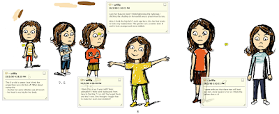
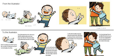
  • And finally, below, is a great real-life example of an Art Director, Lauren Rille, giving feedback on illustrator Robert Neubecker's initial illustrations on how to make the portrayed children more childlike in Sarah WeeksSophie Peterman Tells The Truth.


Lauren Rille's Feedback to Robert Neubecker on his initial Character Designs


Lauren Rille's Feedback to Robert Neubecker on this Spread